The Good APP Logo
The emblem depicts a tree growing from a hand that holds the trunk. The canopy is made of four central leaves and two lateral leaves in dark green, and a group of outer leaves in a lighter green. At the top, an arc represents the sun. Next to the emblem are the name The Good APP and the tagline PROJECTS | PEOPLE | FUTURE. Below, the main colour version and variants for light and dark backgrounds.
Main version (colour)
Logo with full palette: three shades of green and golden arc. This is the reference version in the brand book.
The Good APP
PROJECTS | PEOPLE | FUTURE
Other versions
Dark version for light background

The Good APP
PROJECTS | PEOPLE | FUTURE
Icon in dark tones for use on light backgrounds. Recommended format: PNG/SVG. Minimum height: 32px.
Light version for dark background

The Good APP
PROJECTS | PEOPLE | FUTURE
Icon in light tones for use on dark backgrounds. Maintain good contrast.
Colour contrast and greyscale
The logo must work both in colour and in single ink (greyscale). The greyscale version keeps the same tonal hierarchy as the colour version: the arc, hand and trunk in darker tone; central and lateral leaves in mid grey; outer leaves in lighter grey. This preserves the emblem’s readability in photocopies, stamping, corporate stationery or when only one ink is available. On neutral grey background, both versions should be clearly visible.
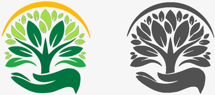
Logo in colour (left) and greyscale (right) on grey background. Use the colour version in app, web and media where the palette is available; the greyscale version for single-ink print or formal contexts.
More about the logo
The name The Good APP and the tagline PROJECTS | PEOPLE | FUTURE are an integral part of the logo; they must not be replaced by another typeface or have their spacing altered. In reduced applications (favicon, app icon), only the emblem (tree, hand and arc) may be used without text, maintaining proportions and clear space.
Clear space
Maintain minimum space around the logo equal to the height of the “T” in The Good APP so the emblem and text are not crowded.
Logo elements
The emblem consists of six elements, from bottom to top. Each item describes what that part represents and which colour it uses in the main version.

Hand
Symbolises the journalist who writes: the hand that holds the trunk shapes the news and supports the narrative. It evokes rigour, craft and responsibility. Colour: dark green (#175A39).

Trunk
Represents the application that connects everything: the central axis linking who writes, who reads and the information. That is why it sits at the centre of the emblem. Colour: dark green (#175A39).

Four central leaves
Embody the four pillars of journalism: honesty, clarity, rigour and veracity. They form the ethical and editorial core of the brand. Colour: green #007c42.

Two lateral leaves
Extend the canopy and give breadth to the whole; they reinforce reach and balance between content and its distribution. Colour: green #22a846.

Outer leaves group
Represent the readers: each receives from those who write the good news that helps them grow. They are the living result of The Good APP journalism. Colour: green #a5dd47.

Arc (sun)
Represents the sun, progress and the joy of good news. It brings light and optimism and reinforces an informed, hopeful future. Colour: yellow / yellow-orange (#e6b84a).
Colour palette
Colours aligned with nature, growth and clarity. Each has a role and a reason in the brand.
Primary colours (The Good APP identity)
#175A39 · PANTONE 343 C
Why: Main colour of the emblem and the name The Good APP. Nature, solidity and trust.
#007c42
Why: The four central leaves (honesty, clarity, rigour, veracity). Deep, serious green.
#22a846
Why: The two lateral leaves; mid tone that adds depth and reach to the canopy.
#a5dd47
Why: The outer leaves group (readers); bright green evoking growth and freshness.
#e6b84a
Why: Arc above the canopy: sun, horizon, energy and “future”. Distinctive element.
#2F3131 · PANTONE 432 C
Why: Single-ink version for stationery, stamping or backgrounds where only grey is used.
Neutrals and backgrounds
#212529
Why: Readability in body text and UI.
#6c757d
Why: For “PROJECTS | PEOPLE | FUTURE” slightly softer than the name.
#f1f8f4
Why: Screen and card background; subtle green tint.
Typography
Why Montserrat: it is the official typeface of the The Good APP logo. Bold for the name (presence and trust), Regular for the tagline (readability without competing). In app and web it can be combined with Roboto for body text.
Logo — Montserrat Bold
The Good APP
Brand name in uppercase. Colour green #175A39 (or monochrome #2F3131).
Tagline — Montserrat Regular
PROJECTS | PEOPLE | FUTURE
Tagline in uppercase, Regular weight. Separator | between words.
Body and UI — Roboto
Lead or highlighted text (20px).
Normal body text (16px) for news and app content.
Small or secondary text (14px).
Type scale
Recommended scale: 12, 14, 16, 18, 24, 32, 40px. Montserrat for brand and tagline only; Roboto (or Montserrat Regular) for headings and body in the app.
Best practices
What to do and what to avoid with the logo and visual identity.
Do
Use the logo with the indicated clear space.
Keep proportions; do not distort.
Use official versions (colour / white / black).
Don't
Change logo colours without authorisation.
Add effects (shadows, outlines, 3D).
Place on backgrounds with poor contrast.
Resources
Download the logo files and emblem parts. All paths are local: clicking will download the file when opening this page from your computer (file://) or from a server.
Brand Book (document)
Same content as this page in document format: cover with brand, headers and The Good APP colours. Open in the browser to print to PDF, or open with Microsoft Word / LibreOffice and save as .docx or .odt.
Open Brand Book (document)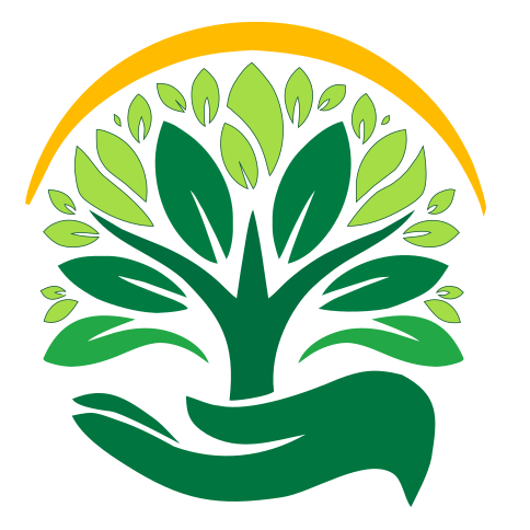